

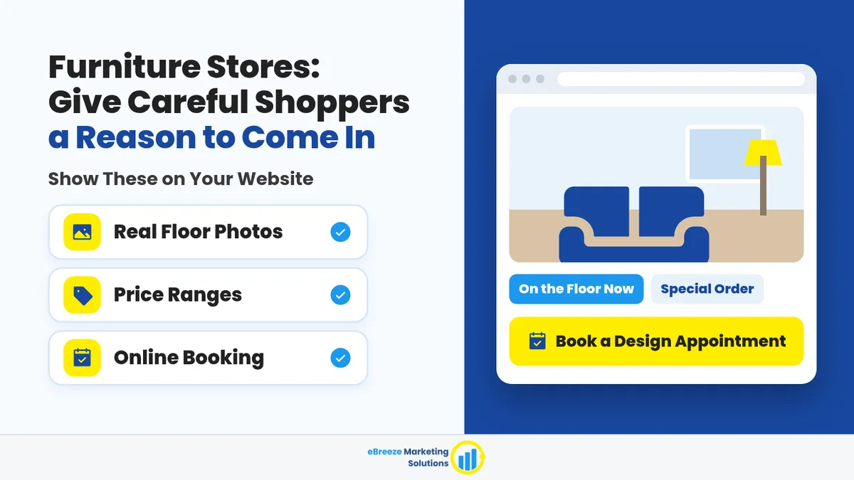
Furniture Stores: Give Careful Shoppers a Reason to Come In
Furniture Shoppers Are Taking Longer to Decide. Your Website Gives Them No Reason to Come In.
Your shoppers are still browsing. But your site still looks like a brochure from five years ago. It shows stock photos of rooms that aren't on your floor and a big "Contact Us" button that feels like homework. So all that looking never turns into a booked showroom visit. They just open another tab.
That is the mismatch right now. Furniture shoppers take longer to decide. Your website still acts like they might impulse-buy a sofa on their lunch break. They won't. They need a clear reason to book time on your floor.
Shoppers Take Longer Now, but Your Site Still Expects Impulse Buyers
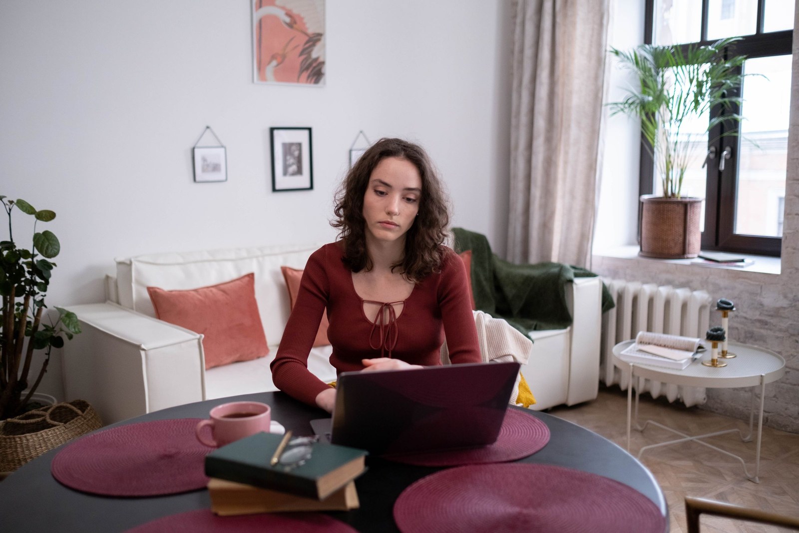
This is not a hunch. In early October, an industry article covered Bassett Furniture's earnings call. Chairman and CEO Rob Spilman Jr. said the consumer "remains cautious" and that "folks are taking longer to pull the trigger." Shoppers are still interested in bigger projects. The hard part is getting people to commit.
Bassett also said orders placed on its website jumped 48% in the quarter. Spilman credited better website navigation and product presentation, plus marketing like an 84-page fall catalog. You do not need to copy Bassett's catalog. But notice what they worked on: how easy the site is to get around and how the products look. When people take longer to decide, those things matter. Pretty pictures alone are not enough. Shoppers also need a clear next step.
People are still shopping, even when they take their time. If your site hides what is on your floor and how to book a visit, they will make up their minds without you.
A site built for impulse buyers flashes a big photo at the top of the page and hopes someone calls. Careful shoppers need something else: a reason to put a design appointment on the calendar before they park.
Stock Photos and "Contact Us" Don't Earn the Trip
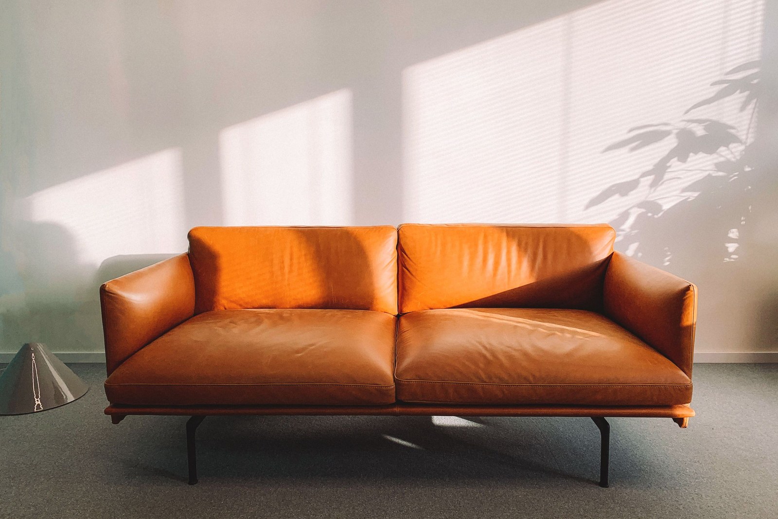
You have probably seen this kind of site. The big photo at the top shows a living room that was never on your floor. You can't tell what is in stock and what is custom. There are no price ranges, so every sofa looks like it might cost a car payment or a whole car. And the only next step is "Contact Us," the junk drawer of website buttons.
If shoppers can't tell what they would walk into, they keep looking somewhere else. That is not stubbornness. That is common sense. Coming in to order a custom sofa is a different trip from coming in to buy the one on display. Booking a design appointment is a different next step from filling out a contact form. When your site blurs those together, shoppers keep browsing and never book.
Owners feel this as website visitors who never turn into booked visits. The photos look fine, and the floor is real, but the site never shows shoppers that the two match. So shoppers keep comparing tabs, and your expensive furniture never gets a fair look in person.
"Contact Us" is where good intentions go to wait three days for a reply. Shoppers have already spent weeks looking. They are not racing to fill out your mystery form.
Show the Floor Before They Park
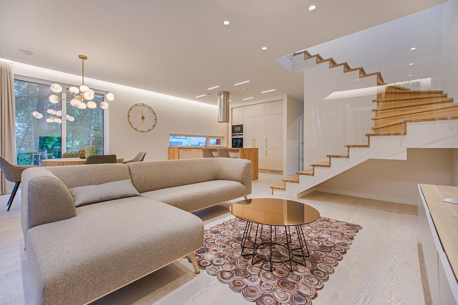
For these shoppers, a better website doesn't mean a new logo. It means showing your real floor before they spend the gas to drive over.
That means being honest about what is in your showroom. Show real pieces and real rooms, or at least say clearly what's on the floor. Call out custom fabric and special-order options in plain words. Show price ranges so shoppers don't have to guess and get scared off. Then tell them enough that booking a design appointment feels worth it: which rooms you help with, what happens at a visit, and who should come.
You do not need a thousand products online. You need enough truth that a careful shopper can picture the trip. If the sectional on your homepage is actually on the floor this week, say so. If most of what you sell is special order, say that too. A clear answer beats a pretty photo that leaves them guessing.
When the site shows the floor clearly, the visit stops feeling like a blind date with your inventory.
Make "Book a Design Appointment" the Obvious Next Step
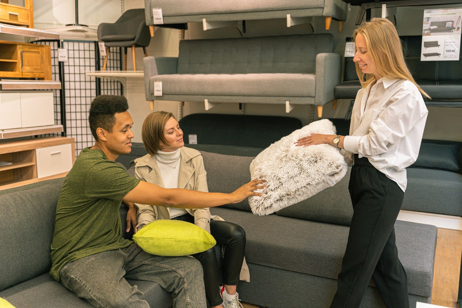
Once the site shows the floor, make the next step boringly clear: book a design appointment on the floor — or a showroom visit, if that is what you call it.
Say who it is for. Say what to bring and what to expect. Make it easy to book from a phone. Ask for a short note about the room, a rough budget range, and a timeline. That is enough to protect your team's time. You are giving shoppers one obvious path, so your staff isn't guessing when a couple walks in.
That little bit of information is a gift to your floor team. If your salesperson already knows it is a living room refresh with a mid-range budget and a spring timeline, the visit can pick up right where the shopper left off. Your team's time on the floor stops being a lottery ticket.
Walk-ins can still come in and look around. The booking button is for people who already spent two weeks comparing fabrics. They want a set time with someone ready for them, not a hope that someone is free when they walk in.
FAQ
Do we need full e-commerce to compete when shoppers browse for weeks?
No. Plenty of showrooms do fine without a full online checkout. Shoppers still want to sit on the sofa, feel the fabric, and talk through the room. Your job online is to show the floor honestly and make the design appointment easy to book. Selling online is a separate choice. You don't need it to win over shoppers.
What goes on our website, and what do we save for the design appointment?
Put the basics online: real pieces or honest "what's in the showroom" notes, custom and special-order options in plain words, price ranges, and what a visit covers. Save the detailed room plan, fabric samples, and final picks for the appointment. The site earns the trip. The floor earns the sale.
How do we show custom and special-order options without confusing people?
Label them in everyday words, like "On the floor now" or "Special order, custom fabric." Add a short note on how long it takes when you can. People get confused when every photo looks like you can take it home today, but half of what you sell takes eight weeks to arrive. A clear label is kinder than a surprise on visit day.
Why does "book a design appointment" work better than "Contact Us" for careful shoppers?
"Contact Us" could mean anything, so shoppers put it off. "Book a design appointment" gives them a set time and a clear reason to come in. These shoppers have already spent weeks deciding. Saying yes is easier when they know what the visit is for, and your team knows a little about the room before they walk in.
Give Careful Shoppers a Reason to Book a Visit
Shoppers taking their time is the new normal. Your website either turns that slow browsing into a booked showroom visit, or it loses those shoppers to another tab. Show your real floor before they park. Make "book a design appointment" the obvious button. And retire the stock photos that make your site look like an old brochure.
Want your website to turn all that browsing into time on your floor? Here's how we help home showroom retailers.
